The Perfect Jar Label
Find out how our label designs make our new Jam Labels stand out for your customers
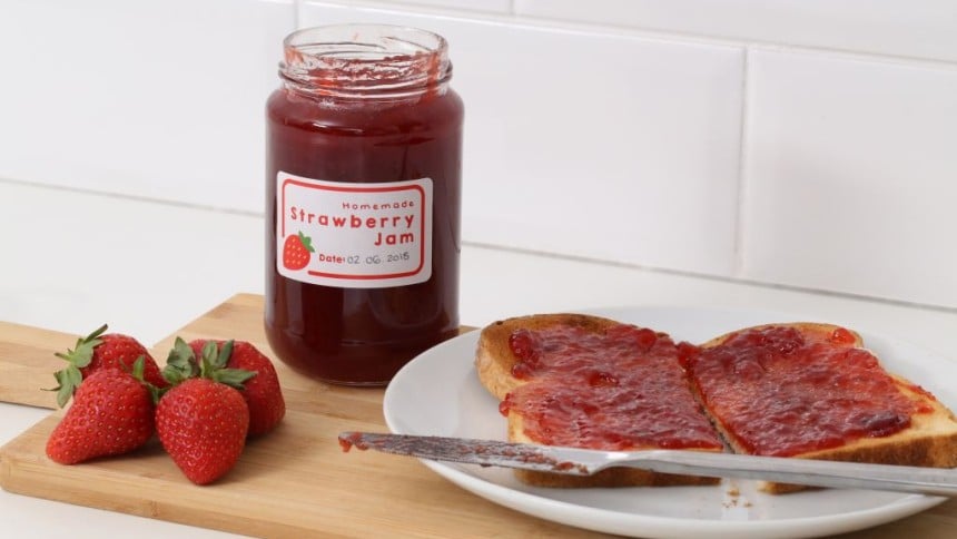
The way a custom label or sticker looks and feels can make an impact on how a product or package is perceived. We commissioned a unique psychological study to give an in-depth understanding of what makes a successful label interesting and persuasive. We have also taken the findings and applied them to our new Jar Labels range.
Continue reading below to find out how our jar labels are designed to stand out and attract the attention to your products.
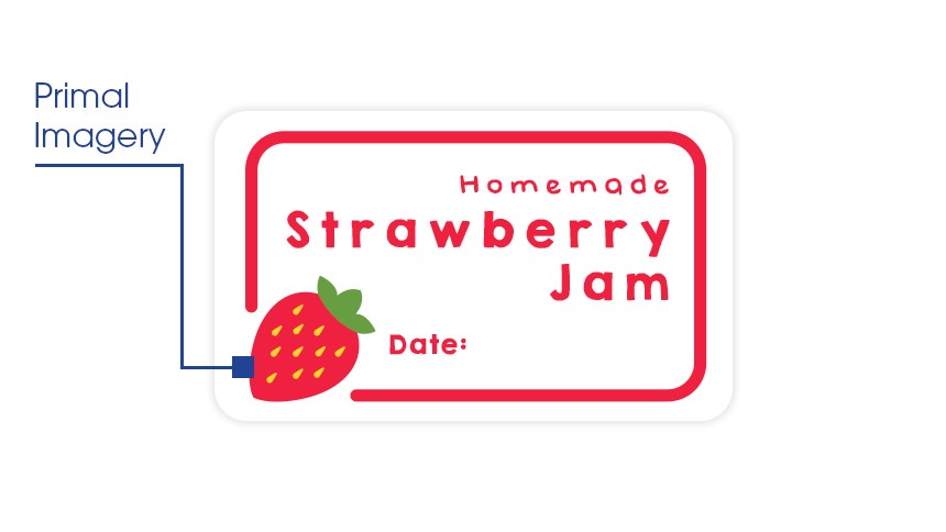
Primal Imagery
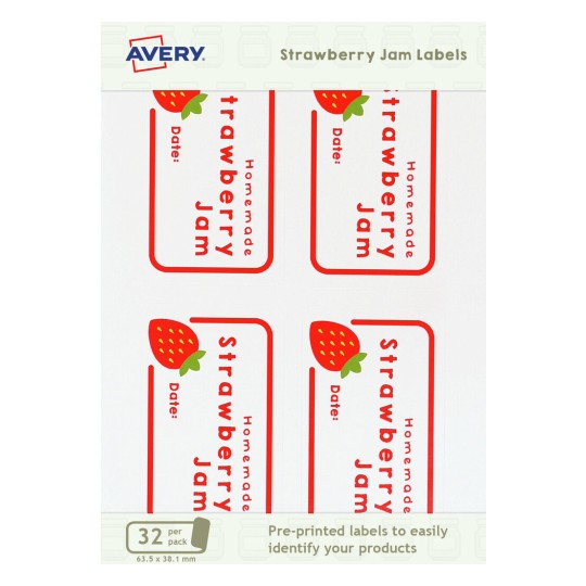
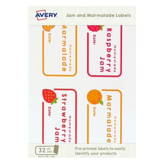
Grab attention with visual stimuliThe fruit icon not only signifies the contents of the jar but is also engages the primal part of the brain which helps draw very strong attention.
Imagery of food is a really good visual because it triggers a primal part of our brains so we are naturally drawn to images of food.
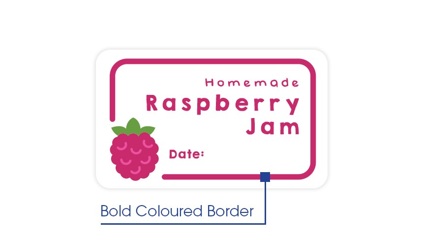
Bold Coloured Border
Use colour to attract attentionUsing a bright colour and a bold line border naturally draws the eye and helps the label stand out.
Bright and bold colours on a label can help draw attention, especially on a white background.
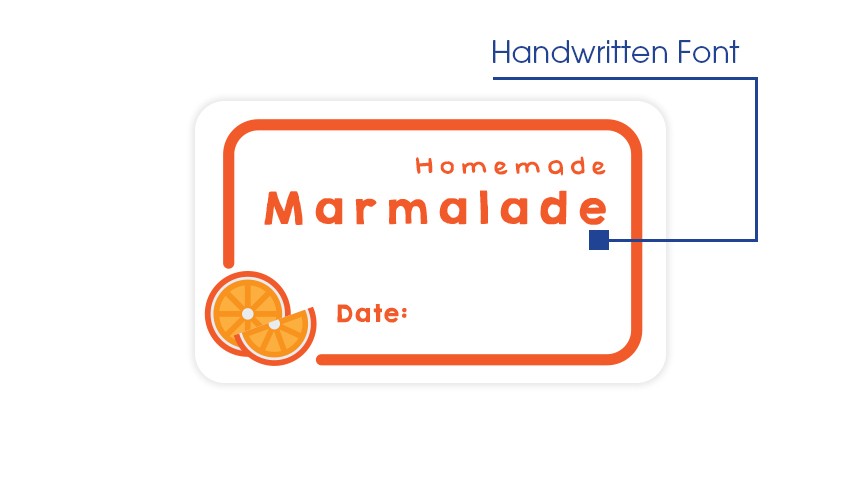
Handwritten Font
Engage and persuade through a friendly looking labelFostering perceptions of openness and friendliness, a hand written font is very effective in helping customers warm to a brand.
Using this font along with highlighting that it is 'homemade' will give much more personal touch to your labels which can also help promote customer loyalty.
Avery Jar Labels
Click on a product for further information
We’ve created a report for small businesses with the key research findings that will help you sell more products and increase brand loyalty.
Download the Report
See for yourself how easy it is to create product and shipping labels that will impress your customers in our 60 second videos.
Go to videos