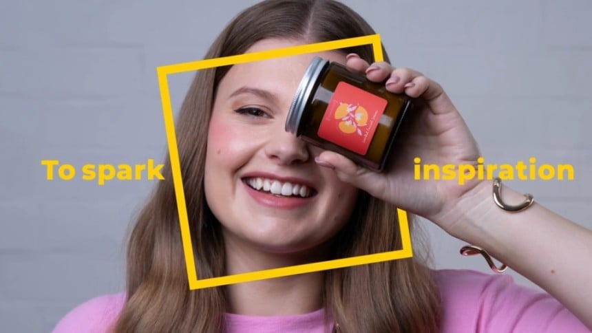
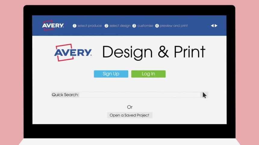
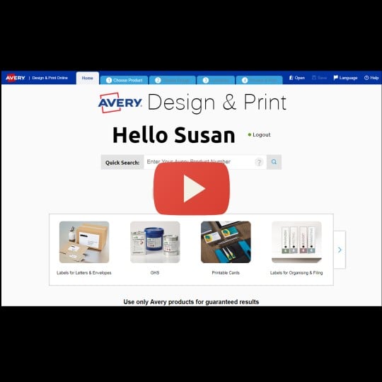
Avery Design & Print Online
Create, design and print your labels and cards today!
Our label creator allows you to select and personalise templates and then print it yourself or let us print it for you.
- Customise a design or upload yours
- Add custom fonts, colours & graphics
- Easily import data with our mail merge
- Save projects online
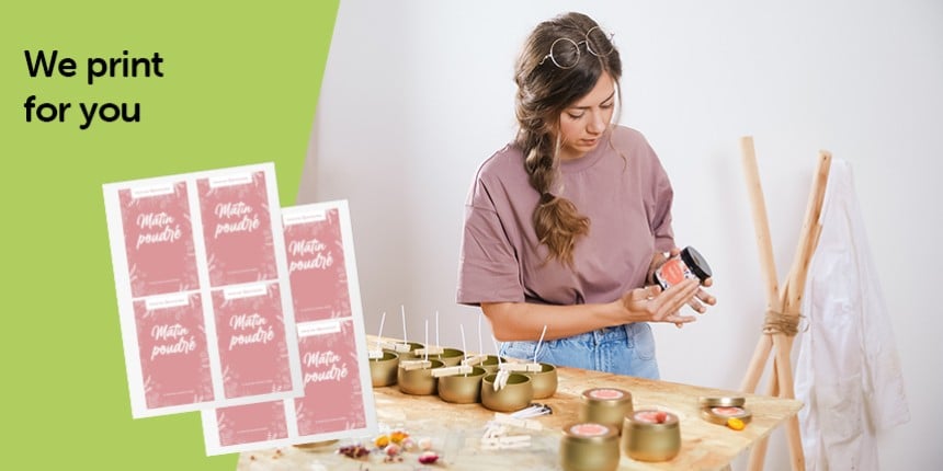
Create stunning designs using our free online label and sticker design editor. Our easy-to-use designer allows you to select and personalise templates to print yourself or we can professionally print and deliver them in as little as 1 working day.
- Select pre-designed templates or upload your artwork
- Add images from your computer, social media or our clipart gallery
- Easily import contacts or data with our mail merge feature
- Automatically generate QR and Barcodes, serial numbers and batch codes
- Design on any device, anytime, anywhere, saving your projects to the cloud
- 48 paper label from £12.24 incl. VAT
- Customise the shape, size, material and finish
- Upload or create a design with our designer
- White underprint at no extra cost
- Fast delivery within 1-3 working days
- 48 plastic stickers from £15.79 incl. VAT
- Upload or create a design with our designer
- Custom shapes & sizes
- Single stickers or sheets
- Fast delivery within 1-3 working days
- 24 blank white labels from £1.12 incl. VAT
- Order A4 sheets in any quantity
- Wide range of sizes, shapes and materials
- Fast delivery within 1-3 working days
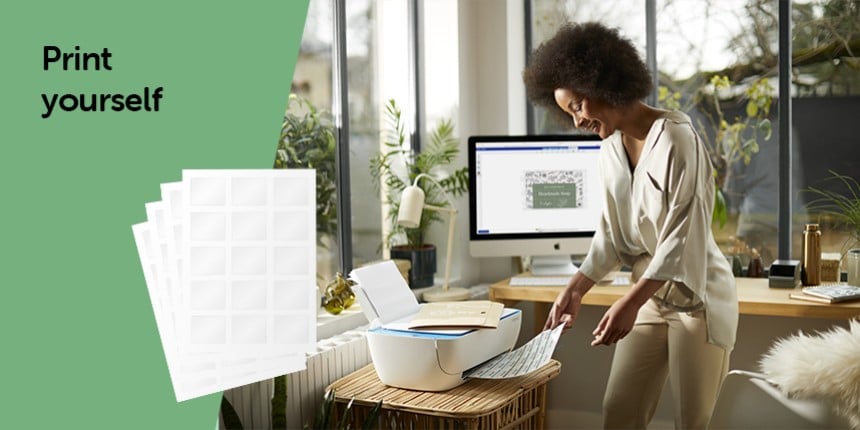
- Print from home using FREE templates
Open Template in Design & Print
After entering your product's software code, follow the simple steps to select your template design then add text and images.
Already have a Design & Print account?
Click here to Login.
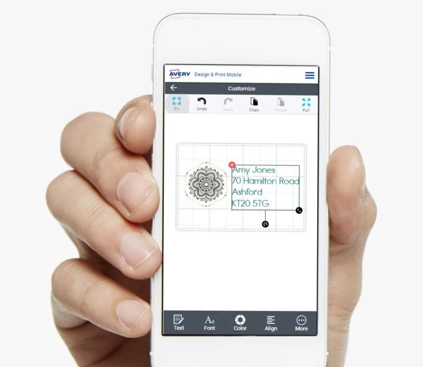
Design & Print on your Mobile
If you would prefer to do your designing on the go, Design & Print can be used from any mobile phone connected to the internet.
On your phone right now? Simply open Design & Print and the app will detect if you are using a screen size smaller than 7" and redirect you to the mobile version of the Design & Print software.
Now you will be able to create your label designs no matter where you are*.
* Please note, at the moment it is not possible to print your PDF directly from your phone's browser unless you use Safari. Please email your design to a Computer to print from the desktop version of Design & Print.
Want to watch our tutorial on how to create your label design on your mobile phone?
Design & Print Mobile Video Tutorial
It takes less than a minute to see what Design & Print can do!
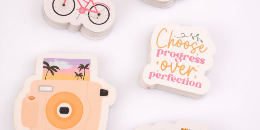
Lots of lovely design templates!
From birthdays and holidays to baby showers and weddings, we’ve got the perfect design for you. Choose from a variety of styles and apply to any Avery product.
We're Here to Help
We understand using new technology isn't always easy, but we're here to help you along the way:
Our help guides and articles offer step by step instructions on our software, as well as offering general printing tips.
We also have a series of easy-to-follow videos which demonstrate how you can use Design & Print.

If you prefer the help of a real person, our consumer centre are always on hand to help if you get stuck

If you have been using old Avery software, discover how you can convert your files to Design & Print