How to choose the right font for your labels
Choosing the right font speaks volumes about your brand and products. Which is why we have created this How to choose the right font guide. Avery want to make label design a little easier. Let’s take a look at some of the font styles you can use with our free software; Avery Design & Print
It’s not just what you say, it’s how you say it. And choosing the right font speaks volumes about your brand and products. Which is why we have created this How to choose the right font guide.
The font you choose for your labels and stickers is going to say a lot about your brand’s image. It’s something you want to get right from the off. After all, you never get a second chance to make a great first impression!
We know that looking through fonts can feel like a minefield. There are thousands to choose from. After you’ve decided on the font for your design, have a read of our scientific study into the impact of labels to understand which label designs perform best.
Avery want to make label design a little easier. Let’s take a look at some of the font styles you can use with our free software; Avery Design & Print
How to Choose the Right Font
Your label is more than just words. The font style, colour and size makes a big statement. The font can help express a mood, establish a style and even create an emotional connection with your buyer.
But how do you choose the right font that does all this? First, you need to really understand your brand's personality.
Create a clean, understated look.
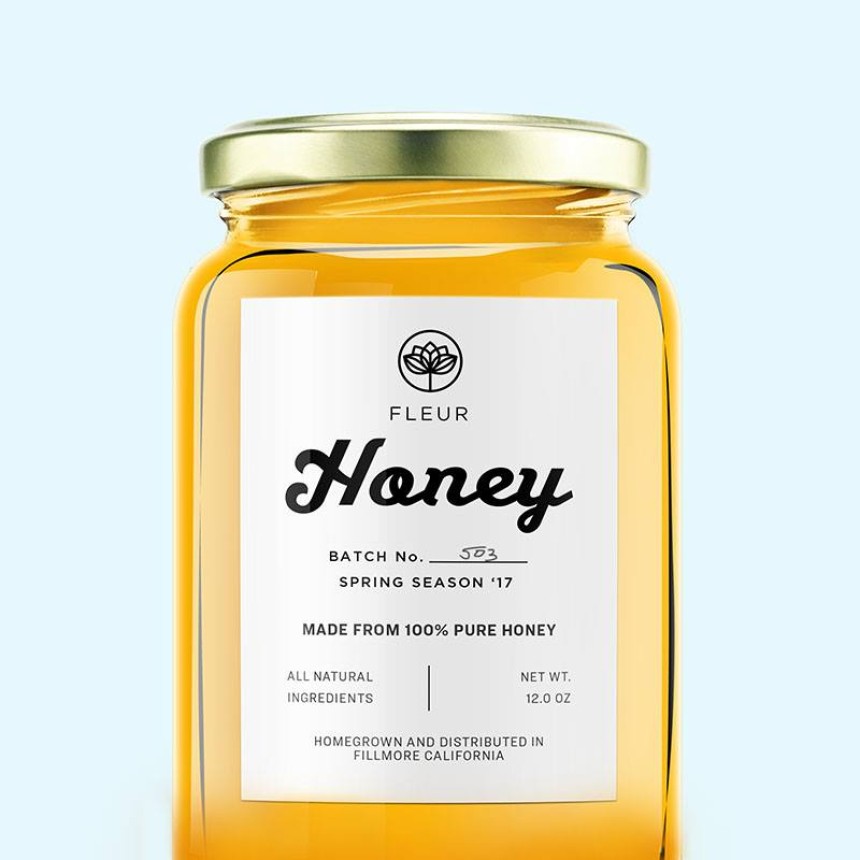
We love how the combination of script font with a sans serif font makes the name on this Honey Label stand out, while keeping the rest of the information readable.
What's your brand's personality?
Firstly, you need to know your brand's personality. Is it playful, sophisticated, corporate or edgy? Who do you hope will pick this product up when it’s on the shelves?
Get all of this in your mind before you delve deep into the world of fonts. Once you have nailed this it will be much easier to find the right font or font combination.
Simple, elegant and sophisticated
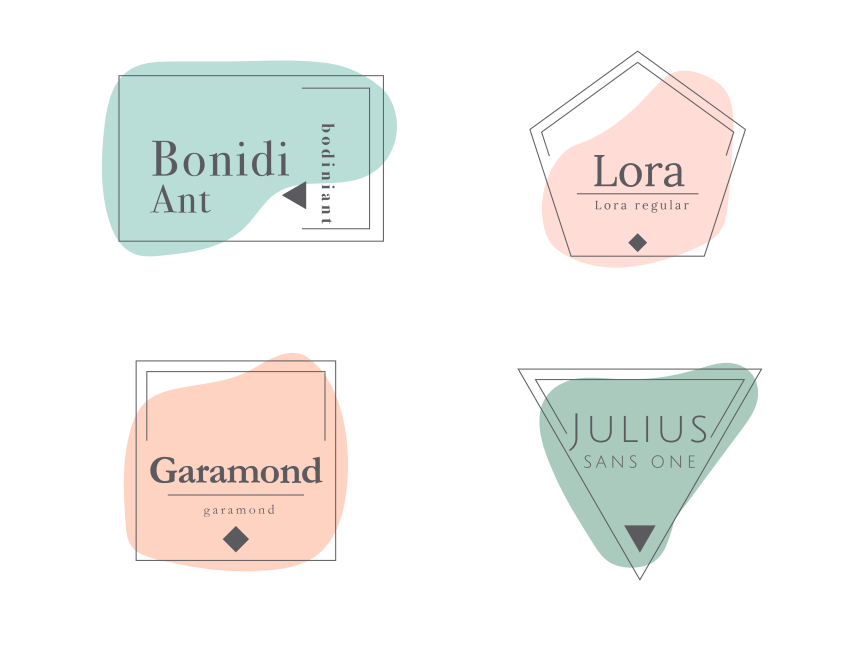
If you have decided that your brand is simple and elegant, consider fonts with narrow lines that have a classic look. We think you might like these elegant fonts which can be found inside our free label designer:
- Lora
- BodoniAnt
- Garamond
- Verdana
- Scada
- Scripts
- Poiret One
Earthy and artisanal, with a slightly rustic vibe
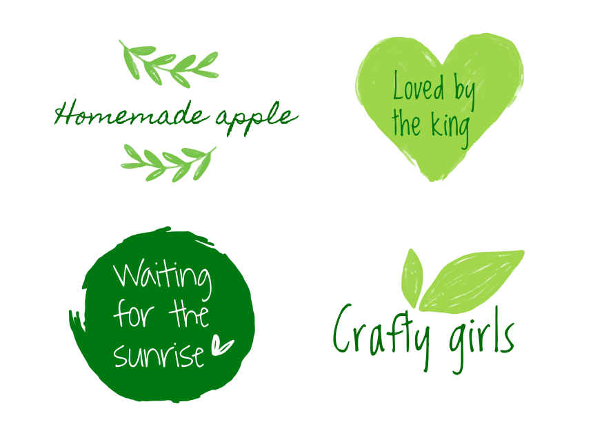
According to our Psychological Study, handwritten fonts help a customer warm to a brand. They give the impression of being friendly. Of course, they aren’t suitable for all brands or products, but they might work for yours. When using Design & Print, have a play with these handwritten fonts:
- Bella Donna
- Crafty Girls
- Homemade Apple
- LuedickitalD
- Loved by the King
- Shadows into the Light
- Sue Ellen Francisco
- Waiting for the Sunrise

Playful and personable
Do you see your brand as a little quirky with a playful but personable side? When look for something with plenty of curves and a hint of embellishment. For something fun and playful when using Design & Print to create your labels you might like:
- Lakki Reddy
- Princess Sofia
- Pacifico
- Gasoline Alley
- Lobster Two
- Crafty Girls
- Creepster
Modern and bold.
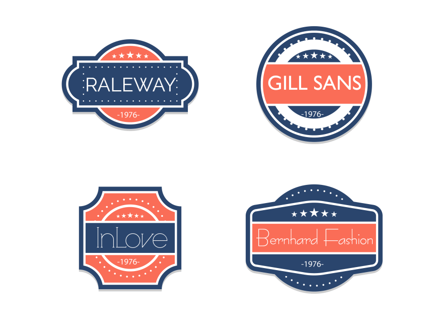
Modern and bold fonts are simple. Often, they appeal to the majority. Try out fonts that are more angular with a uniform structure. You might want to give these Design & Print fonts a go :
- Raleway
- Gills San
- Bernhard Fashion
- InLove
- Poiret One
- Scada
- Endurance Pro
- Julius Sans One
Quick tips when choosing a font
Before we get into some font ideas, here are some things to keep in mind when choosing a font.
- Know your audience. Understand who you are hoping to sell too and choose fonts that will draw them in
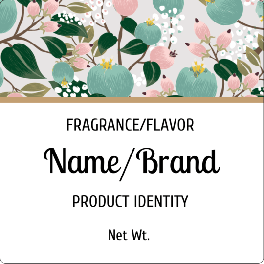
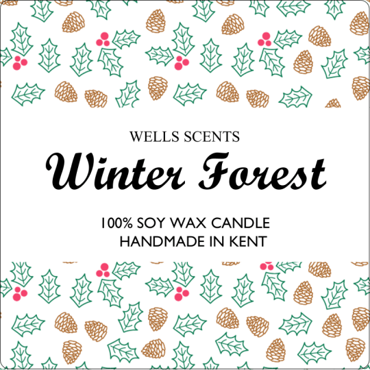
- Couple fonts carefully. Combine script or display fonts with simple fonts so they don’t compete against each other
- Make it readable. You don’t want people mispronouncing your brand because your T looks like a Y in the script you chose.
- Keep within regulations. Make sure the font is accessible and meets regulatory standards for your product
- Get creative. Try out different fonts with your imagery and graphics to see what works best
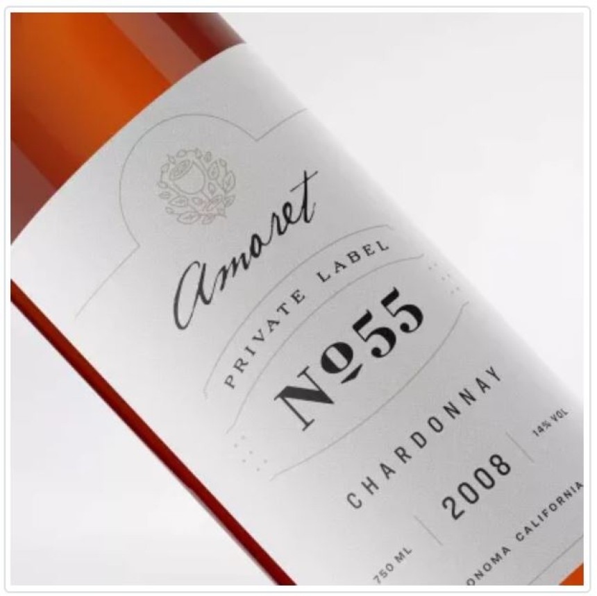
Spotlight the hierarchy of information.
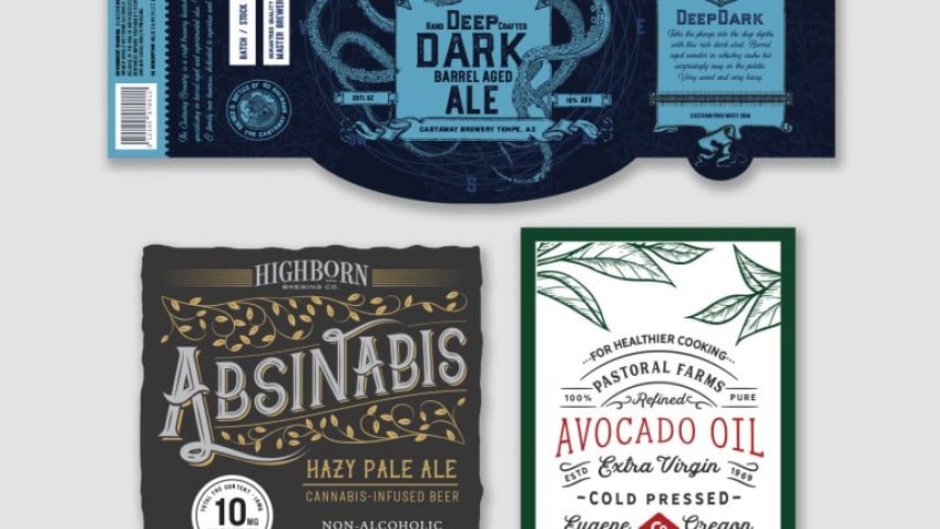
The use of both script and display fonts helps the brand and wine name punch through. The simple fonts clearly display the key information

The type of lettering you choose is crucial to your label design. But with so many fonts to choose from how do you get it right?
Here are some simple tips to help you achieve the right balance between style and practicalities when choosing fonts or typefaces for your labels.
What messages do fonts give?
Fonts are very expressive and can say a lot about your company, brand or product in a subliminal way. So the first step is to consider what will go with your product or brand and what will appeal to your target market.
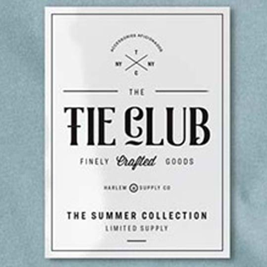
Serif fonts have small decorative lines at the end of strokes. They give a classic, traditional, upmarket, respectable, authoritative, literary, classy and warm look e.g. Times New Roman, Garamond.
Sans serif fonts are generally more readable, especially in small print. Clean and modern, these fonts signify innovation, neutrality, reliability and professionalism, e.g. Arial, Helvetica Neue.
Script fonts – for a handwritten look or elegant, ‘joined-up’ writing, these fonts are often used for a natural, rustic or feminine feel
Display fonts – with fancy and fun designs, these fonts can evoke an era, a theme or a vibe and need to be used carefully
The two types of font above work best for headings or short messages and should be avoided for long paragraphs or extended text: If you’ve already decided on a font for your logo, you may be able to carry that font through in headings and short messages.

How many fonts should you choose?
We generally recommend up to three different fonts per label:
Product name Brief description, message or headings Information and small print.
Font or typeface, which is correct?
These days they mean the same thing, but there used to be a difference. When printing involved painstakingly setting metal letters (the type) in frames, the typeface was the name of the style of letters used and the font was a set of blocks of type in a particular size and weight.
Label font do's and don'ts
- Do check your chosen font for readability from a distance if your labelled products will be on display.
- Do make sure the thin lines are visible and that the numeral 1 and capital I am not likely to be confused.
- Don’t use a font that looks like a major brand’s logo – think of Disney, Coca Cola, Nike, Google or Lego, for example.
- Do an experiment – with the Avery WePrint online design tool you can try different variations online, and you can get just a couple of sheets printed to see what works best.
Find out how easy it is to design your labels using our online design tool – read more.
Discover our most successful label designs
And customise them using Design & Print. Simply click the design you like to apply it to your Avery product:
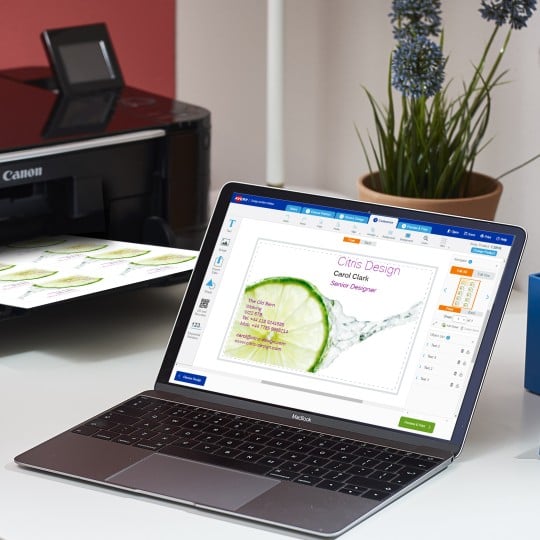
Avery Design and Print Template Software
Our free software includes all sorts of creative tools to help you design and print your Avery products, perfectly, every time.
Ready to print?
