How to design a great logo
Make a logo to boost your brand
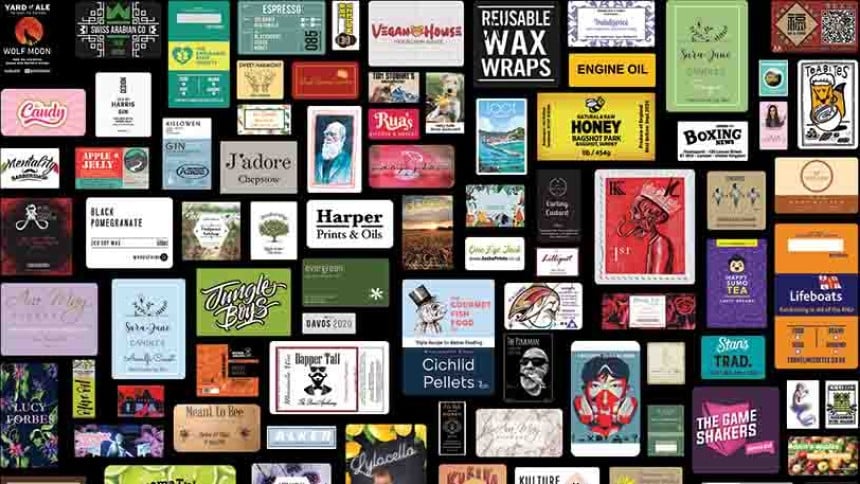
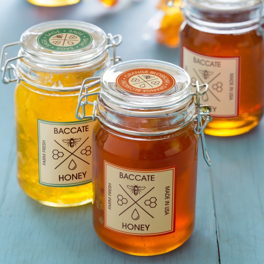
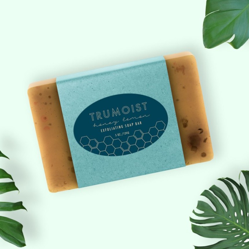
Your logo is often one of the first things your customers see. Whether on business cards, product packaging, marketing materials, custom labels, stickers or your website, your logo should always be front and centre. Creating a logo is also a very big step and one that should be well thought out - it needs to be more than just a pretty picture.
Here are some tips we've picked up from our own customers we'd like to share with you:
Why does my logo matter?
A well executed logo will:
- Make your business easy to remember
- Increase brand awareness
- Create a bond with your customers
- Separate you from your competitors
Your logo is the first thing any customer or potential customer will see about your company and what you hope it represents. Avery completed a detailed and in-depth study of how logos and labels can be used to help small businesses attract attention and encourage purchase. We found that humans make decisions based on automatic, emotional and primal instincts. People process visual stimuli more rapidly and fluently than words, so your logo needs to do the talking for your brand.
Know yourself
Effective logo design starts by understanding your business and target audience. Think about what makes your company unique and what captivates your audience, because at the end of the day, your logo is an extension of you and your business.
Before you start, have a look at your competitors so you can see how they target your customers. Then think about what makes your different from them and what makes you special. Separating your brand from your rivals' is intelligent logo design.
Choose your colours wisely
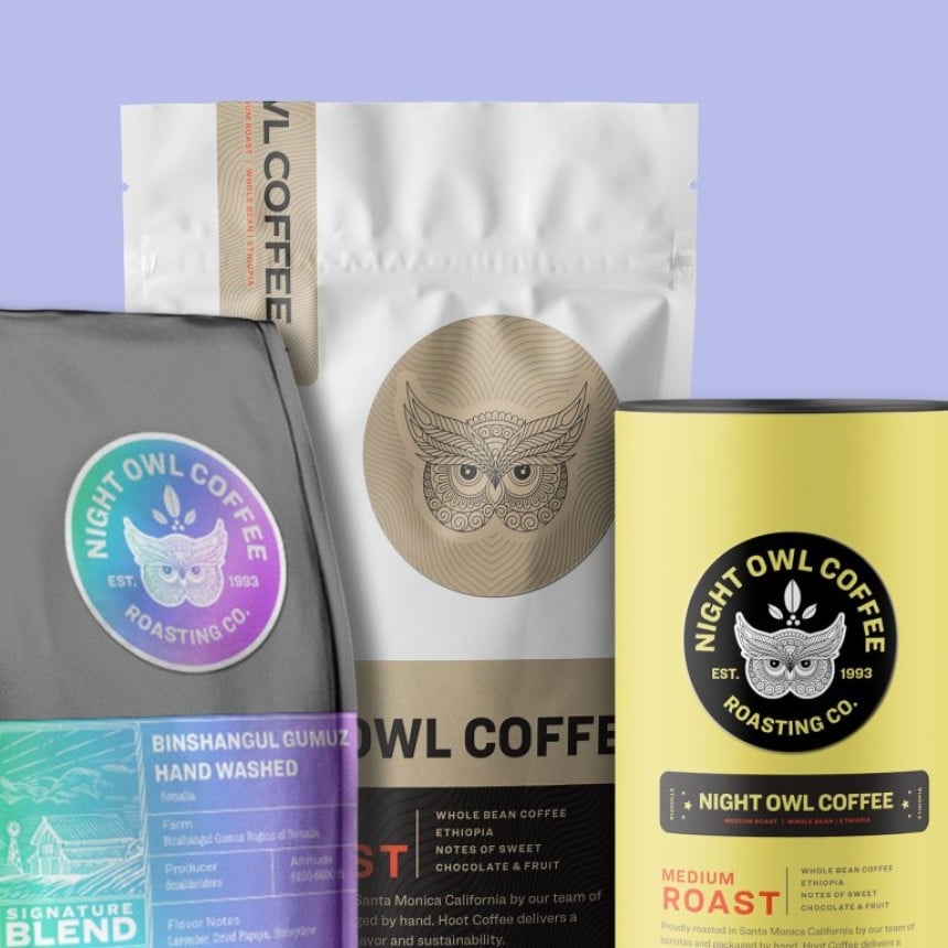
"Keep it simple" is the rule when it comes to the number of colours in your logo. By keeping the numbers low, it'll be easier to transfer your logo onto different coloured collateral. Think about how your logo will look on your company stationery, business cards, website, product labels, merchandise and more.
Also think about your target customers when you decide upon your colours - people respond to colours in different ways. What might look great to you, may not appeal to your audience. For example, soft pastel colours might look great for baby products, but maybe not so much on a beard oil brand?
Colour combinations also matter in terms of readability. Red and green look great at Christmas time, but these contrasting colours are difficult to read on business cards. Try to avoid using colours that have seasonal ties.
It's all about the font!
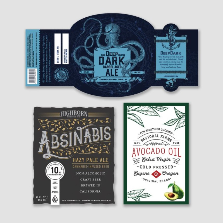
The typography you use on your label communicates more than just words. The fonts, size, colour and even combination of different fonts can express a mood, establish style and create an emotional connection with consumers.
Logos come in three basic types: those with only a symbol, those with only a typeface, and those that contain both. The typeface or font used should reflect the personality of your business and engage your audience. What’s the personality of your brand—is it fun, sophisticated or down-to-earth?
To find out more about Fonts and typefaces, have a read of our article Choosing the best font for your labels
How Avery can help
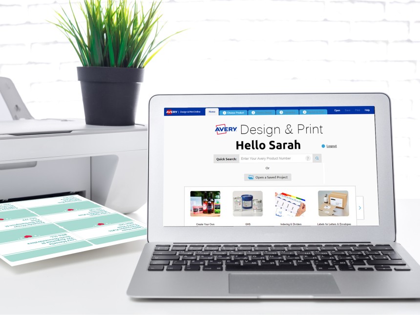
If your budget allows then hiring a professional designer can be an option. However, if you're looking for a more affordable route and feel like tapping into your inner designer then our free Avery Design & Print online tool can help you. This free software includes a collection of creative fonts and an easy to use canvas on which to start designing.
No matter which path you take, a logo can be a critical element of your marketing strategy. And it’s an investment in your business. When you make sound decisions with your logo design, it can pay off in many ways for years to come.
Avery Design and Print Template Software
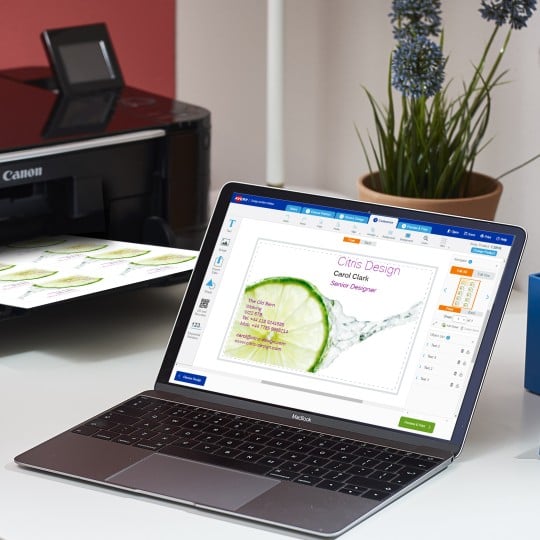
Our free software includes all sorts of creative tools to help you design and print your Avery products, perfectly, every time.
Ready to print?
