The Art of Label Design

When it comes to the art of design, Rick Bruce-Kelly certainly knows a thing or two about intriguing and pleasing the eye of a precious customer. After completing a degree in product design at Staffordshire University, he went on to a career in graphic design with the likes of Super Snaps and Black & Decker before setting up his own design, print and web company, InDzine, with a former colleague in 2003. We asked Rick what small businesses should think about when designing their own branding and labels.
How important is the art of design in branding?
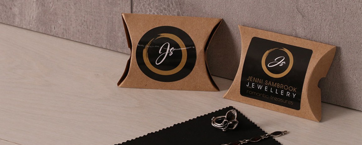
Personally, I think it’s probably one of the biggest things. For example, whether you’re in jewellery or soap products, the first contact is going to be on your packaging or literature and if that’s at a high standard then that reflects on the quality of the product or the quality of the service you’re going to get. You can have the best products but if your custom sticker or label, packaging, literature or website is not up to scratch then they’re not going to buy your product. If you’re at a craft fair and you’ve got some horrible-looking packaging and the person next to you has a more professional look then the customer’s going to go straight to them.

If you could pass on 3 pieces of wisdom when designing your own labels what would they be?
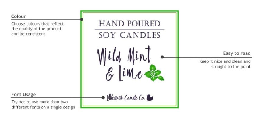
- Colour - Choose colours that reflect the quality of the product and be consistent. If everything you use across your website and literature is navy blue, then your label should reflect that too.
- Font Usage - I try not to use more than two different fonts on a single design. When people start to put too many fonts on one thing it can be a bit of a car crash.
- Easy-to-Read - Keep it nice and clean and straight to the point. Make the name of the product, business or service obvious rather than choosing to use a huge logo by itself.
What are the advantages of using WePrint?
I like how WePrint gives you the option of shape and size of label and helps to point you in the direction of the best sort of label for your product. You can start from scratch with a blank template or you can adjust some of the examples they already have to offer. It’s very good for producing quick labels and it works well.
Should you allow label design to be put down to personal taste or should businesses take heed of trends and find out what works best in their market?
They should find out what works best in the market and find a label that reflects them. If they’re selling hand-crafted items then the label probably doesn’t want to be ultra-modern. The label should always reflect exactly what the business does. Businesses could follow a trend but does that trend fit their brand?
What are the latest trends in design and has anything been overdone?
There is still a lot of use of three or four script-type fonts on a vintage brown background and I think that’s a trend that has now been overworked. Now people are starting to cut everything back and are going much more simple. I’ve noticed everything has gone much more flat colour and very simple shapes.
How can businesses make their labels stand out from the crowd?
As the Avery ‘Power of a Label’ report agrees, in addition to the design of the label itself, its position on the box or envelope or parcel is very important. Make sure it’s prominent and putting it on straight is usually a good starting point! If you’ve got a label that’s skew-whiff or not printed straight then it might make customers wonder whether what’s inside has just been thrown in there too. They may even worry it’s been damaged.
It is also crucial to get your message across in your label design. Sometimes you see a label and you can’t read it straight away, especially if the product is on a top shelf. Keep it simple and strong.